Communicating with existing and potential customers is more important than ever right now. They don't…

How to Make the Best Print Ad for Your Nonprofit Company
People see an average of 5,000 different ads every single day. This makes creating successful ads more competitive and creative than ever before. To stand out from the crowd, your ad will need to evoke interest while still being informative. The goal is to attract and engage your target audience using a few key objectives. Wondering how to make the best print ad for your nonprofit company? Read on to learn how to make one that will get attention.
Make It Eye-Catching and On-Brand
When you create a print ad, it’s essential to keep branding consistent. This works to help the audience identify your nonprofit company’s key brand elements.
Branding and Color Palette

It helps for your ad to include your logo, slogan, and font. You may also want to choose your organization’s colors, or go with something different. Certain colors can even evoke an emotional response from the viewer.
It’s also important to choose colors that print well. This includes a font style that reads well on the chosen background color.
Layout and Design
A good design layout makes all the difference in whether people take notice of your ad. It should be easy to read without being too busy. It helps to experiment with different layout designs to find the one that looks the cleanest.
You also want to pay attention to the amount of white space you use. The ad’s alignment and margins are also key design features.
A quality image that grabs attention is often the most important aspect of ad design. Stock images can work in a pinch. But new professional images will probably have a more positive response.
It’s also a good idea to use a graphic designer that can offer some insight when planning your design. This makes the ad more unique and it will stand out more.
Printing Techniques
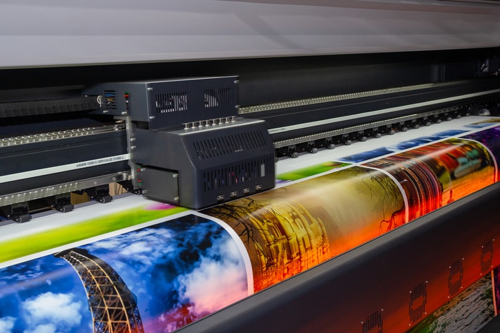
You also want to consider different printing techniques when designing your ad. Digital printing techniques are compatible with most color palettes. Wide formatting printing can also be effective in making your ad more noticeable.
Write Relateable Ad Copy
A print ad gets used to help get your company’s message across. This means that text is often needed to inform the audience. Yet, you don’t want to include too much text as it may bore them.
Readability is one of the most important components of a good ad. It sways a person’s decision on whether they will read your ad.
Ad copy should be short, well-written, and to the point. Font size and text, as we said above, are also important in capturing the viewer’s attention.
It’s important to select a writing style that appeals to your audience. It helps to use powerful buzzwords that relate to your audience on an emotional level.
A creative and catchy headline works to tie everything together. Be sure to pay attention to the placement of the headline. It should be the first text that the audience reads.
Breaking up the Text
It’s best to only list the key objectives on your ad. This could be an upcoming charity event, or a donation request, with more information.
You can use subheaders when needed to break up copy. Bullet points are also easier for people to digest than large blocks of text.
Hemmingway is a great resource for checking the quality of your writing. This makes it easier for the average reader to comprehend.
Consider Your Call to Action
Print advertisements for nonprofits need a call to action. This works to encourage a direct response from them. This action could be donating, attending an event, or volunteering.
Keep the call to action simple and understandable. This will make it more effective and you’ll get a better response.
Be sure to include a way for your audience to get in touch. This could be by phone, email, or in person. This is important for readers who want more information or have feedback.
Encourage Social Engagement

Your ad design may be for print, but that doesn’t mean it can’t connect to the digital age. Succesful not-for-profit printing campaigns should have a social media tie in. This attracts more people and offers a great way to connect with younger audiences.
Including social icons or handles is a great way to get readers to interact with your brand online. They may even end up following you on social.
Including the nonprofit’s website on your ad is also important. It’s a way for the reader to gain more information about your cause. They can also learn about upcoming news and events.
Proofread Before Going to Print
A final proofread is one of the most important steps when printing ads. Always double check spelling, grammar, and sentence structure. You also want to ensure that the contact information and dates are correct.
It also pays to pick a full-service printer for more pre-press quality control. This includes extras like checking alignment, coloring, and image proportions. They also help with digital output and file conversions.
How to Make a Print Ad That Wows Your Audience
These tips will teach you how to make a print ad that calls people to action. Ads that follow these techniques send a powerful message to your nonprofit’s audience.
After your ad is designed, be sure to consider different printing styles. It’s important to select one that fits your project and works within your budget.
There are also many other ways to promote your cause or marketing campaign. This includes direct mailing services to increase the number of people who see your ad.
Learn more about how Action Mailing and Printing Solutions can help enhance your next ad campaign by contacting us today.


Comments (0)